Colors
Brand and Style Guides
Print Applications
Web Applications
Video Conferencing Backgrounds
Other Applications
Downloads (Internal Only)
Colors
The Naval Postgraduate School uses three primary, signature colors that establish and strengthen our identity as both a U.S. Navy institution and a university, and the colors’ appropriate usage is an integral part of effective strategic communications.
NPS’ official primary colors are represented in the chart below, with appropriate supporting secondary colors included. Consistent and professional use of color is a critical feature of effective communication design. Simply using more colors does not necessarily mean a product will be more effective.
Secondary colors are carefully selected to match hues and tones together, providing a portfolio of shades that work in concert with each other, rather than competing with each other. The human eye will be more engaged with displays of color that are complementary and connected, not disjointed and diverse.
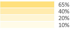
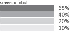
When creating your own communications, take care to use these exact numbers when creating color on your documents — do not use “close enough” colors. In addition to the colors at 100% tint, screens can be used where indicated at the following percentages: 65%, 40%, 20%, 10%.
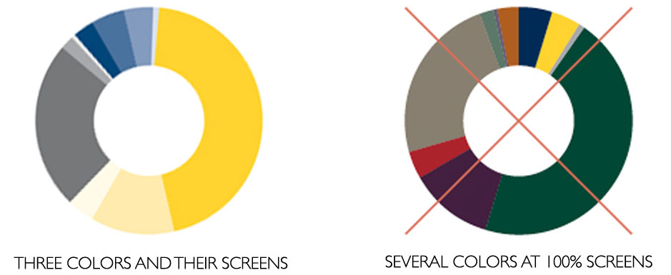
NPS Blue and its screens should be used as the “go-to color” when creating documents, with NPS Yellow used as an accent color. Never use NPS Yellow for body copy on a white or light grey background. If creating graphs and charts where many colors are needed, select a few complementary colors and use their tints. It is not recommended that you use all the colors for a single document or graphic, but rather choose a few that look good together in conjunction with their tints. Always avoid using other blues that might compete with NPS Blue.
NPS Primary Colors and Screens at 65%, 40%, 20% and 10%
*Use black at 40% as a substitute for Metalic Pewter which is a specific PMS color for offset printing.
NPS Secondary Colors


